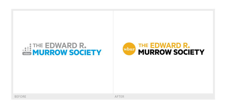
It was a great opportunity to re-design a logo I initially worked on.
This iteration brings the branding more in line with the branding of WBUR. The color palette uses the organization’s yellow and black paired with a strong, clean typeface following an information hierarchy where the focus is on Murrow Society and then WBUR.
The WBUR Edward R. Murrow Society are comprised of donors who give gifts of $1,500 or more to support independent journalism.
Leave a Reply