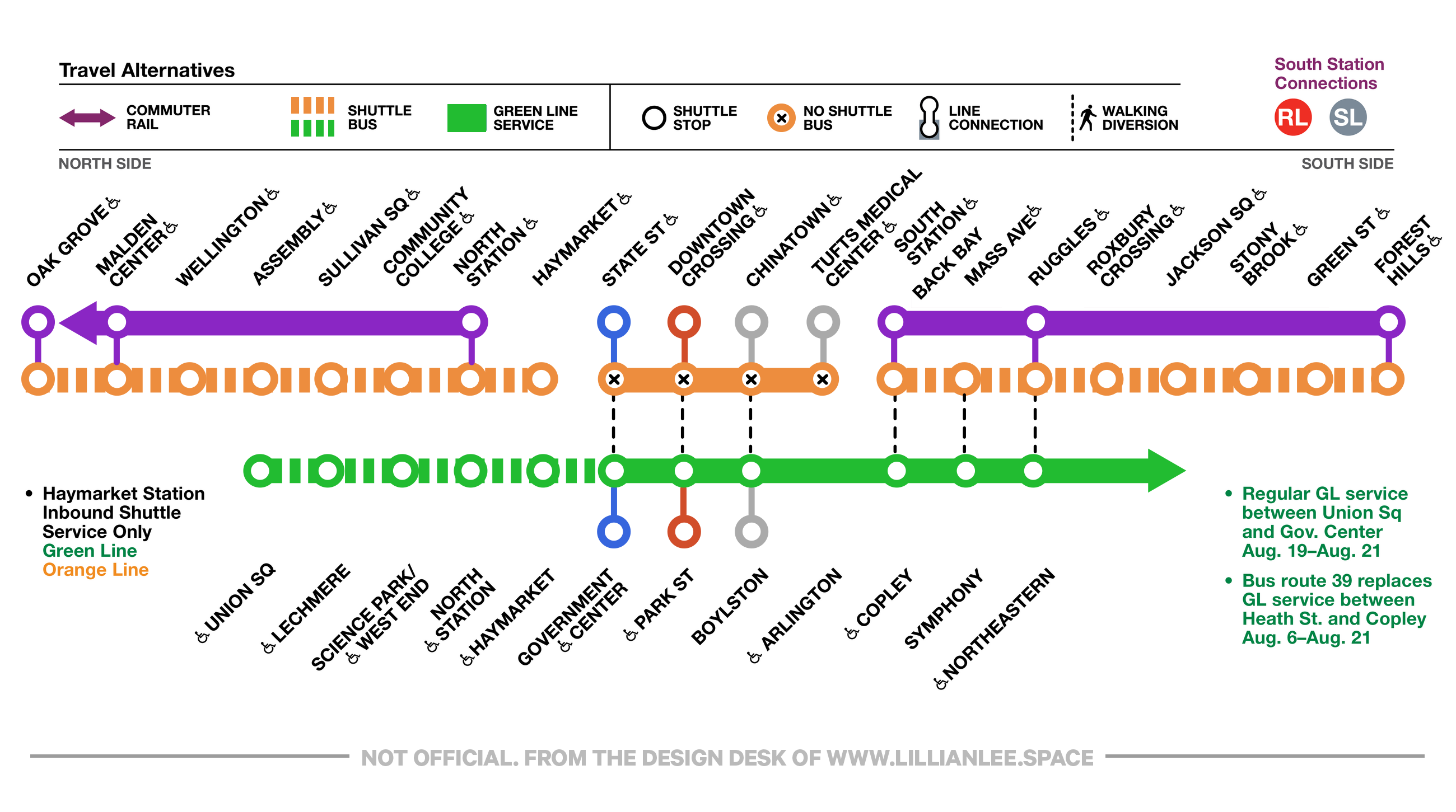
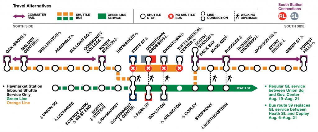
This is just a quick attempt at reigning in the visual hot mess of the official MBTA orange line shutdown map that was released to the public. I mean, I get it – all the information needs to be listed and highlighted. But, when everything is highlighted, then the information becomes moot visually.
For my version, I refrained from using the black outline for everything because the walking diversions and closed stations could be highlighted and more easily digested. The decision to put color blocks underneath the line connectors is an odd choice. I can barely make out the color and it ends up taking valuable visual space.
Anyhow, this shutdown is going to suck and I’ve already resigned myself to shuttling to Back Bay and then just walking to my final destination. At least I’ll be getting my steps in.
Leave a Reply